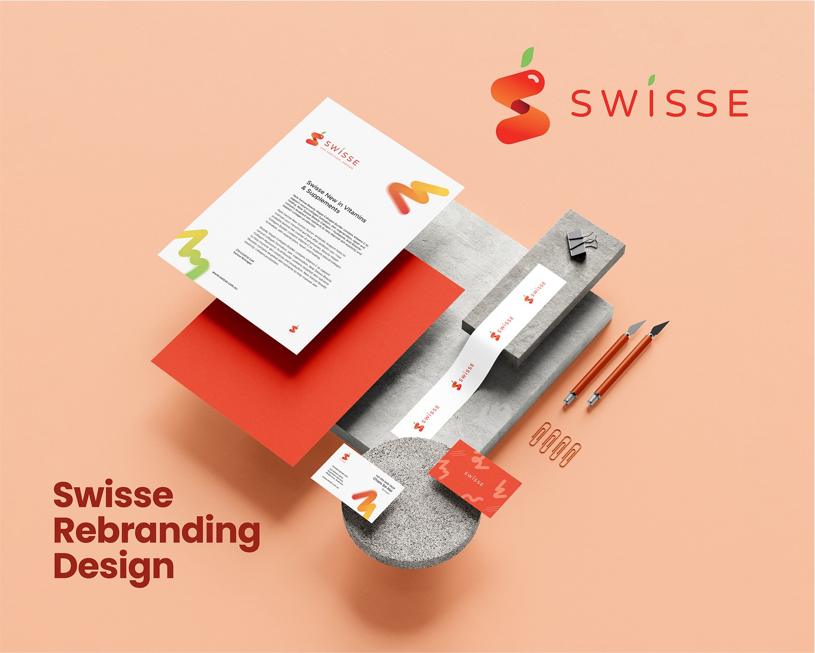
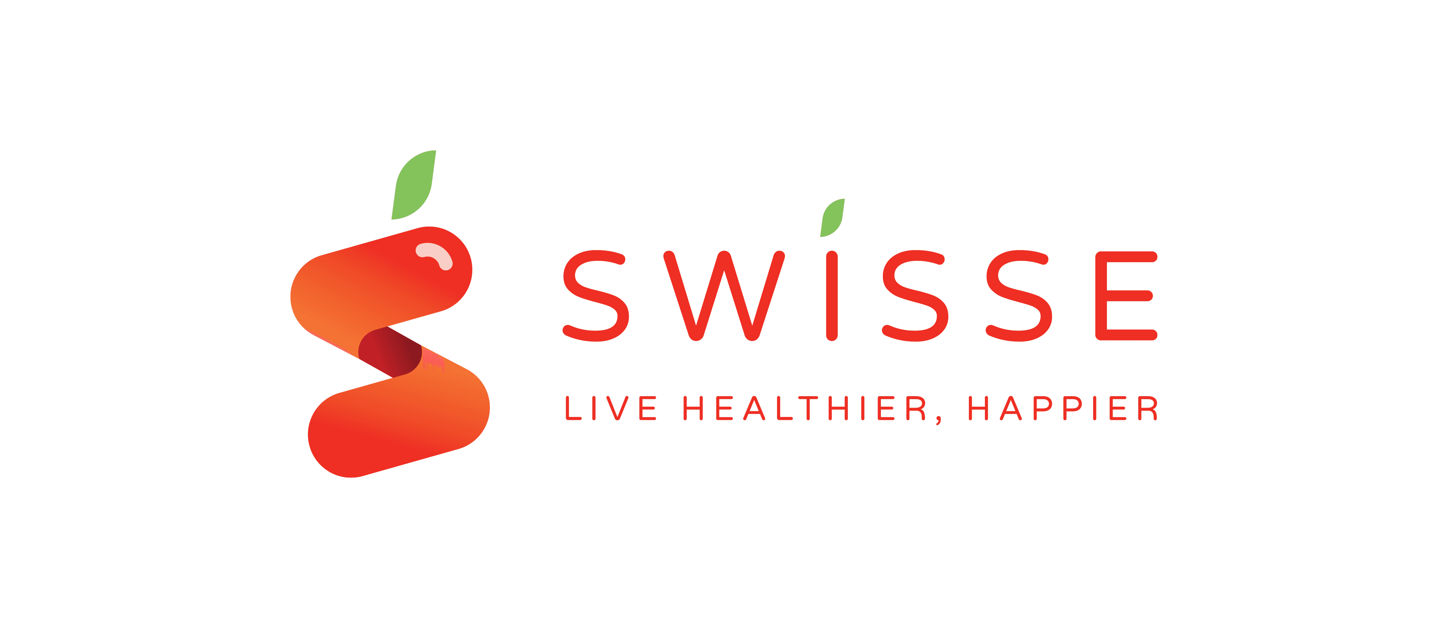
Swisse has always been dedicated to health, happiness, and sustainability. To reflect this commitment, the new brand identity modernizes Swisse’s image while maintaining its core values. Why the rebrand? The refreshed logo embraces a capsule-inspired design, symbolizing Swisse’s foundation in health and wellness. The stylized ‘S’ reflects both the brand name and the idea of continuous well-being.
Client
Swisse
Tool
Time
12 Weeks, 2022
The New Identity
Swisse is not just a supplement brand—it’s a lifestyle. This rebrand brings a fresh, engaging look that aligns with modern wellness trends while staying true to its legacy. With a refined visual identity, Swisse continues to inspire people to Live Healthier, Happier.
Designing with Purpose
This logo is designed to be straightforward and instantly recognizable as a supplement brand. By combining the letter "S" with a capsule shape and using a vibrant apple red, it feels joyful, healthy, and bold, making the brand easy to identify.
Logo Clear Space
To maintain clarity and brand integrity, a designated clear space must always surround the logo. This prevents overcrowding and ensures the logo remains legible and visually balanced. The clear space is determined by the height of the largest leaf in the logo, as shown in the guidelines.


Design Process
The concept behind this rebranding was to create a simple yet impactful design that resonates with Swisse’s identity as a supplement brand.
The logo integrates the letter “S” with the shape of a capsule, utilizing color overlays to create depth and a modern feel.
Keywords: Joyful, Industrial, Minimalistic.

Challenges
One of the biggest challenges in this project was creating a cohesive and recognizable brand identity that aligned with Swisse’s values. Figuring out where the brand needed improvement and how to enhance its presence was a crucial part of the process. It required a deep understanding of consumer perception and how design elements could influence their emotions.

Reflection
I’m satisfied with how this project turned out, as it allowed me to explore both my strengths and areas for improvement. The biggest challenge was developing the brandmark toolbox and refining elements to enhance Swisse’s identity.
Balancing vibrancy and calmness was key—while bright colors evoke energy, subtle tones can create a sense of relaxation. Research into color psychology helped me design elements that promote both motivation and tranquility.
Despite the challenges, I enjoyed sketching, finalizing the logo, and building brand guidelines. This project pushed my creativity, and I’m proud of the final outcome within the given timeframe.